
Your collection dashboard, reimagined — June 2026
Your dashboard is no longer just a report, it's an interactive, actionable view of your
collection's value, gaps, and milestones. Filter by when you acquired things, see what your
collection is worth versus what you paid, and get nudged when a wantlist item shows up for sale.
✨ New
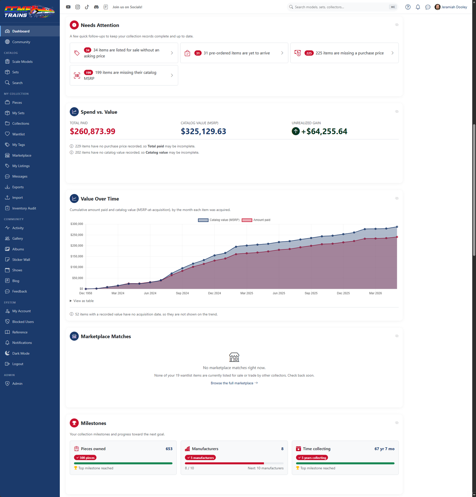
- Spend vs. Value card — See your Total paid, your collection's Catalog value (MSRP),
and your unrealized gain or loss at a glance. - Value Over Time — A month-by-month line chart of cumulative spend against cumulative catalog
value, with a full data table underneath. - Needs Attention — Quick follow-up tiles for records that are missing details, each linking
straight to the fix. - Marketplace Matches — When something on your wantlist gets listed for sale or trade — pieces
and sets — it surfaces right on your dashboard. - Milestones & milestone alerts — Track progress toward pieces owned, manufacturers collected,
and time collecting — and get an in-app notification (with optional email) the first time you
cross one. - Acquisition date filter — Scope the value and composition cards to anything acquired in a
date range. Cards that always reflect your whole collection are clearly badged All-time. - Welcome dashboard for new collectors — A friendly empty-state walkthrough with one-tap ways
to add your first piece, build a wantlist, or explore the catalog.
⚡ Improved
- Smarter charts — Click a chart slice to jump to that filtered slice of your inventory, switch
between chart types, and save your favorite chart setups as presets.
🐛 Fixed
- Set valuations — Sets priced at $0 no longer skew your collection's value totals.
👉 Try it: open Dashboard · Read the full story